Windows 11: A first look
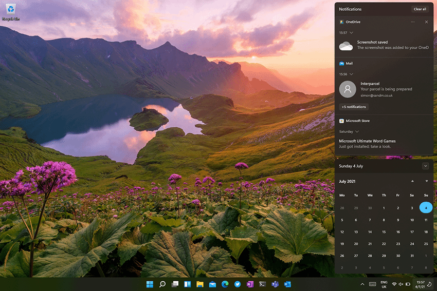
One big change is to Windows 10’s combined Action and Notification Center. These have been separated in Windows 11, with a new look set of notifications that have a much less cluttered look and feel, using the same rounded elements as the rest of the Windows 11 user interface. The Action Center, with its quick controls for system features is now a standalone panel, again using a rounded pop-up. Now, however, it is triggered by clicking around the network and sound controls in the task bar.
Once launched, it has a similar layout to the expanded Action Center in Windows 10, though the new-look icons provide more detail, showing connected WiFi networks and Bluetooth devices, as well as offering both brightness and volume controls. Microsoft lets Windows 11 users add and remove features as needed. For instance, a desktop can have fewer options selected than a cellular-equipped Surface Pro X.
Read the full Windows 11 test drive >>


