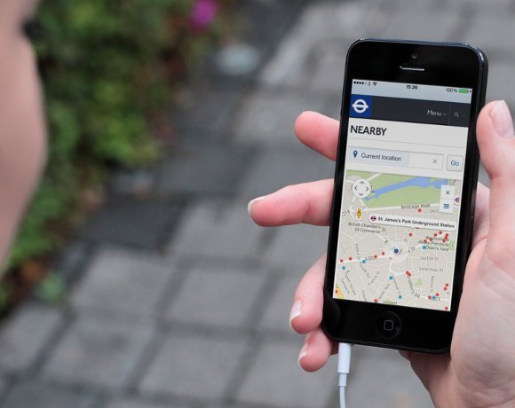
A preview of the new TfL HTML5 website
The new TfL site uses responsive design to reformat web pages in a way that is optimal for the device being used. So, on a smartphone, the new website renders in one column, while a tablet user will see two columns.
"People wanted to use the service across any device; they wanted localisation and personalisation, great mapping and they wanted a considerable improvement to Journey Planner," says TfL's head of online, Phil Young. Customers would never have asked for a nearby function, but this feature meets some of the needs customers have articulated, he explains.
Watch the video interview with TfL's Phil Young >;>;


