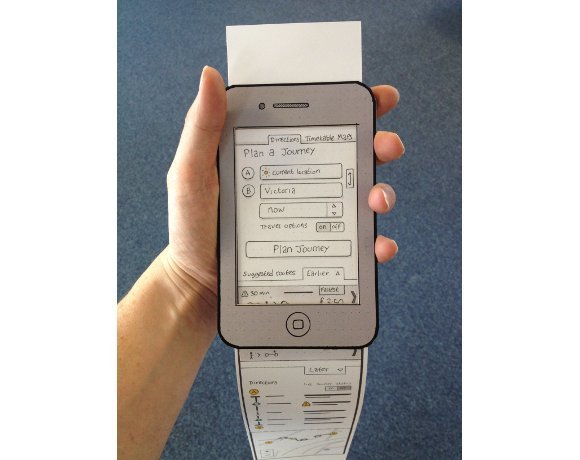
A preview of the new TfL HTML5 website
To build the site and test it with customers TfL created a cardboard smartphone, which allowed the site's developers to see how customers would interact with the mobile site.
The cardboard smartphone has a cut out for the display. The user interface comprised a long strip of paper with user interface elements hand annotated in pencil. Phil Young, TfL's head of online says: "We got the customer to tell us what they liked, and we could rub things out."
Watch the video interview with TfL's Phil Young >;>;


