First look: Microsoft Office 2013
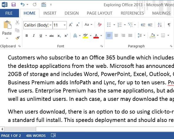
Word 2013, like the other Office 2013 applications, has a redesigned ribbon control inspired by Metro, even though it is a desktop application. One of the goals is to be easier to use with touch, though in this case some of the icons are still too small to hit easily on a tablet with a small screen, such as the Samsung 11.6 inch Slate on which Microsoft often demonstrates Windows 8 and Office 2013. That said, it is an improvement over Office 2010 for touch users. Microsoft’s dilemma is that if it removed more controls from the ribbon then there would be more to learn for users with Office 2007 or 2010.
The Insert tab in the ribbon includes a new option, called Apps for Office. This is for apps written to a JavaScript API that is new in this version. Such apps can be embedded as content in a document, or run alongside the document in a task pane. They are written in HTML and JavaScript, and use Internet Explorer embedded as an iFrame to render their content.


