A first look: Windows 8 consumer preview
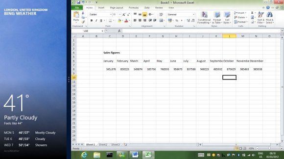
Optimum hardware for a Windows 8 tablet includes a screen with 1366 x 768 resolution, which is an unusual size for today’s devices. The reason is that this gives room for a feature called Snap, where one applications runs side by side with another in 25% / 75% view. This is Microsoft’s answer to the annoyance of a system designed essentially to run all apps full screen, as in Apple’s iPad or Android tablets.
Snap works well on the right hardware (though this excludes most displays available today) and in general Microsoft has come up with a tablet operating system that is a delight to use. Users have to learn a few simple swipe gestures. Swipe from the left to switch apps, or from the right to raise the “Charms” menu, including standard actions such as Search and Share, and buttons for the Start menu or Settings, including shutdown. Swipe from top or bottom to raise application menus, such as the tabs list and address bar in Internet Explorer. Flick up or down to scroll. It only takes minutes to learn, and using Windows 8 on a Samsung Series 7 Slate, which is an Intel Core i5 tablet with the right kind of screen, bears out Microsoft’s claim that Windows 8 is fast and fluid.
What if you are using Windows 8 with keyboard and mouse? The Consumer Preview has new mouse-friendly features compared to the earlier Developer Preview. The four corners of the screen act as hot areas for the Start menu (bottom left), app switching (top left) and raising the Charms (top and bottom right). Right-click in an application is meant to bring up application menus, though if there is a context menu that takes priority which can be a problem.


