James Thew - Fotolia
Hawaii missile alert: Why the wrong guy was fired
In January 2018, an employee at Hawaii’s emergency management agency sent out a false alarm of an imminent missile attack, and was subsequently fired – but perhaps poor system design is really to blame
Most people are likely to have seen the story about the false warning of an impending missile strike on Hawaii earlier this year that had people diving into basements, car parks and sewers to take cover.
I am sure you would have been in there with them, too, if you had received this warning text:

Fortunately, half an hour later the warning was revealed to be a mistake; someone, somewhere had pressed the wrong button. When intending to choose the “this is a drill” button, they had selected the “this is NOT a drill – everyone start panicking” button.
“What a fool,” cried the angry mob. “Fire them immediately!” And sure enough, they did. Almost immediately, the reckless button-pusher was removed from the seat of power, meaning the citizens of Hawaii could sleep easy again.
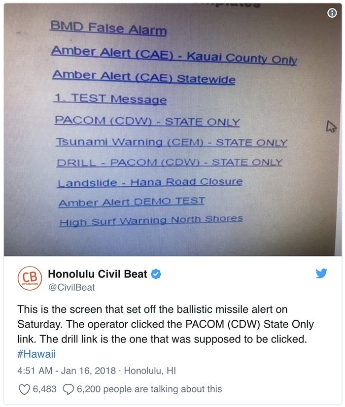
A few days later, however, a screenshot of the button, or rather buttons, in question was published. Suddenly, it became apparent that perhaps the mob had been a bit harsh on the button-pusher:

The only difference between the test button and the send-everyone-into-the-sewers button was the word DRILL in blue text.
Fair enough, I would back myself to pick the correct option nine times out of 10, but where is the exclamation mark? Where are the skull and crossbones? Where is any sort of attempt to point out that selecting “PACOM (CDW) – STATE ONLY” is a huge deal?
In light of the new evidence, there were campaigns for the government to reinstate the unfortunate button operator, as we could all see how their mistake was easily made.
The mob turned its wrath on the designers of the tool, not the operator.
Where to point the finger of blame
So who should be fired?
Should it be the cowboy developer who carelessly built the screen as if it were their first personal website on Geocities? That would be harsh. They almost certainly were not hired on their design ability and probably never had the right training.
Okay, so it must be the user experience designer, right? Absolutely – we’ve got them! Nail that person to the wall for quite possibly the worst-executed selection mechanism ever designed; cast that designer into oblivion for blatantly bypassing the user testing phase of the design.
The only problem is that there was almost certainly no user experience designer. Why would you need a designer to make the buttons shiny and beautiful? There are no customers to attract with a beautiful interface, no data to visualise. That’s what designers do, isn’t it?
It is this misconception about what designers do and when it is important to use them that caused the Hawaii panic.
A designer would have understood that the person in charge of triggering the regular incoming missile DRILL changed regularly, and that they were likely to be doing 10 things at once while deciding which button to select.
A designer would have taken the time to understand the huge difference between a DRILL alert and a real one, and designed quite different ways of triggering them. They would have tested their designs in a realistic environment, with the people who are in charge of pushing the right button.
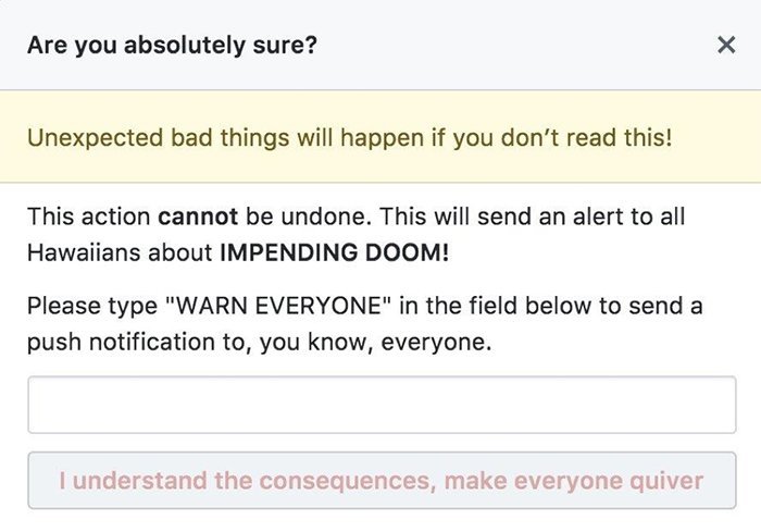
A designer would have made sure that the user had to explicitly confirm their action to send alert messages to thousands, perhaps with something like this:

Unfortunately, it is difficult to fire a misconception. We are after a real-life, breathing human to parade in front of the cameras, to put in the stocks. Who is it going to be?
Fire everyone involved in the misconception
I say we fire everyone who contributes to this misconception, starting with the phoney cowboys who call themselves user experience designers but who design things without involving their users in the process.
Add the bosses of companies that make a business of selling these phonies at an industrial scale, fooling naive clients into parting with their money in return for a shinier, but equally poor product at the end.
And finally, let’s add the IT managers and budget holders who like the idea of designing products in a user-centric way, but do not give designers the time or environment in which to do a good job.
Today, in your town or city, I bet there are thousands of people telling each other (and themselves) that they are “doing” user experience design when they are not.
It is these people who have led to the corruption and commoditisation of the term “user experience design”.
It is these people who have let down those project sponsors, IT managers and developers who saw the potential in user experience design, only to see it done so badly that they will not try it again.
It is these people who have therefore made the case for true human-centric design harder to make, and occurrences such as the Hawaii missile alert more common than they should be. They have to go.
Read more about security and design
- Next-gen Mirai botnet sparks calls for more secure IoT design.
- IoT applications will be a success only if underlying security is ensured.
- Intel to set up new group to focus on hardware security.


